

-
Client
Optiplay is a game development company that creates digital products for the entertainment industry.
-
Challenges
The company needed a recognizable visual identity that could be consistently used across the website, presentations, social media, advertising materials, and digital products.
-
Goal
Develop a logo and brandbook for a game development company with clear identity usage rules — from logo versions to colors, typography, scaling, and incorrect usage examples.
-
Logo
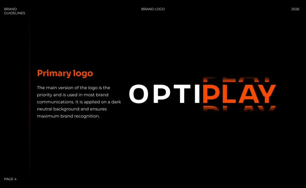
We created the Optiplay logo from scratch and prepared multiple versions for different usage scenarios.
-
Identity
Developed a visual identity system including colors, typography, gradients, and design rules.
-
Brandbook
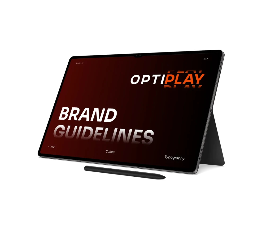
Prepared a complete 26-page brand guidelines document with logo, color palette, and typography usage rules.
-
Consistency
Established a structured system that helps the team maintain a consistent brand style across all materials.
For Optiplay, we developed a logo and complete brand identity system from scratch. The project included logo creation, color palette selection, typography, identity usage rules, and a complete brandbook.
Logo development
The first stage of the project was creating the Optiplay logo. For a game development company, it was important to design a mark that looks modern, technological, and adaptable across different media formats.
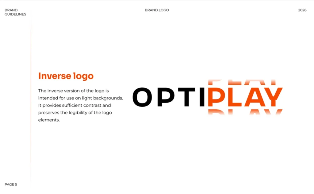
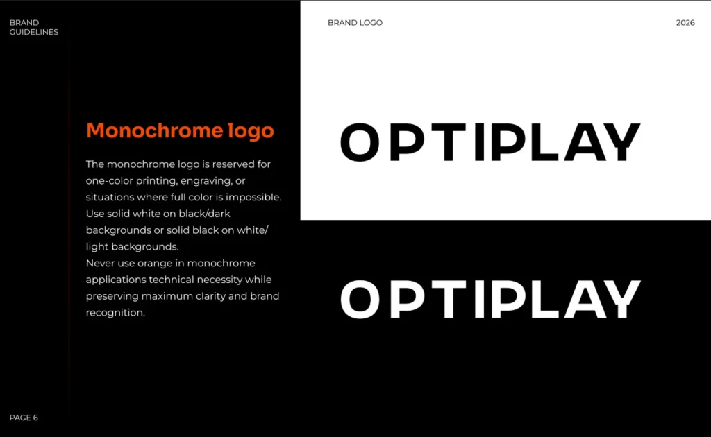
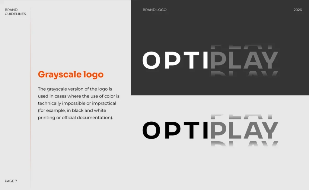
We prepared the main logo version, inverse version, monochrome version, grayscale version, and a compact icon version for small formats. This allows the identity to work equally well in large branding materials and digital interfaces such as favicons or social media icons.
Logo usage rules
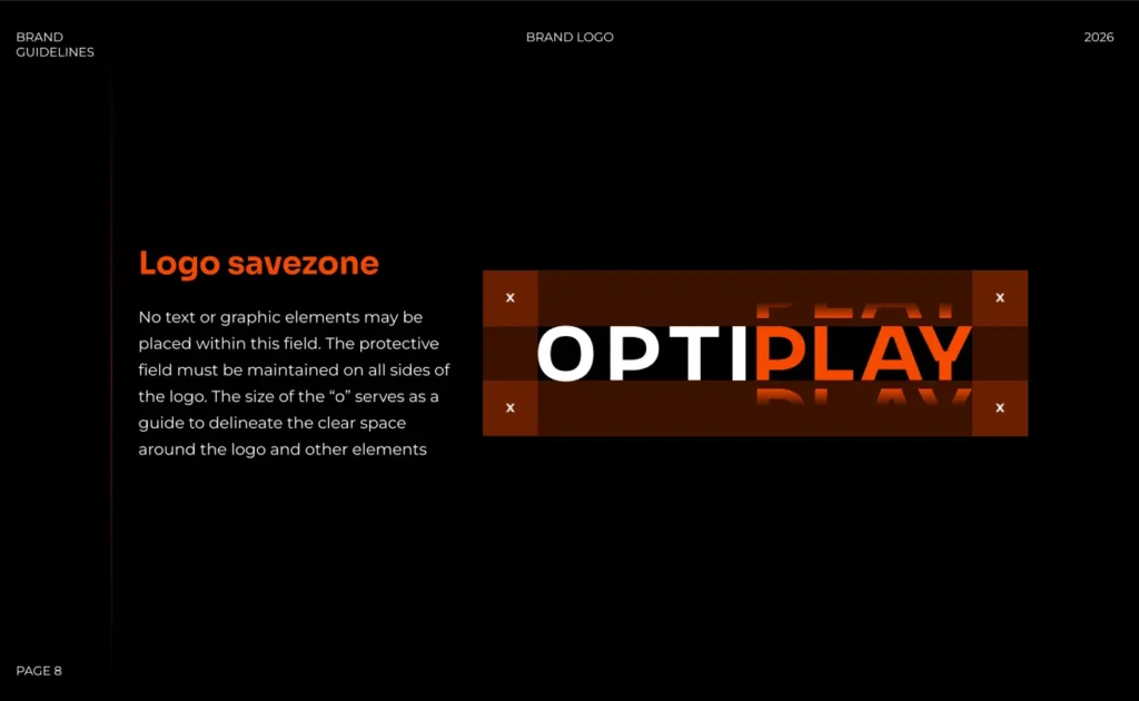
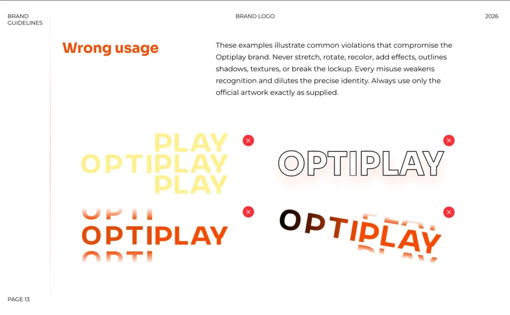
Inside the brandbook, we documented the logo usage system: clear space, minimum size, versions for dark and light backgrounds, and incorrect usage examples.
This ensures that the logo is never distorted, recolored, overloaded with effects, or used in a way that weakens brand recognition.
Color system
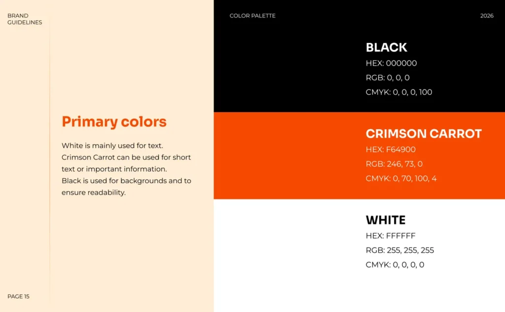
For Optiplay, we created a high-contrast color system built around black, white, and a bright orange accent. The palette feels energetic, dynamic, and fits well within the gaming industry.
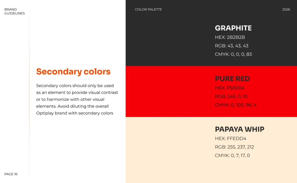
The brandbook also includes secondary colors, background solutions, gradients, correct color combinations, and examples of combinations that should never be used.
Typography
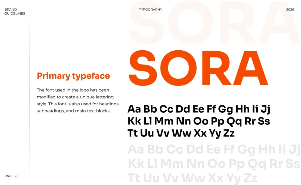
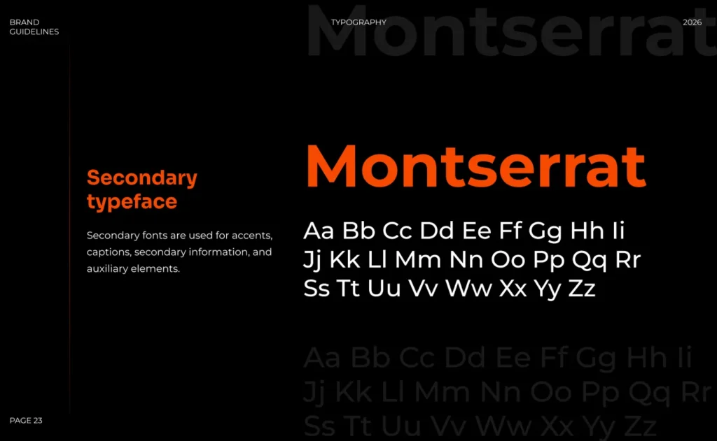
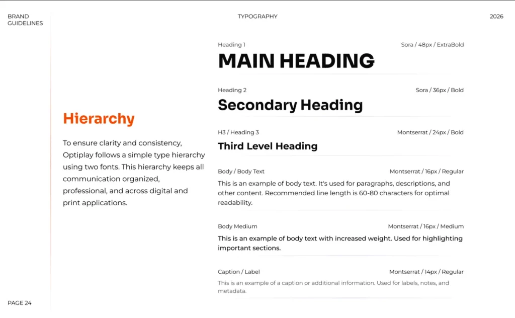
A separate section of the brandbook focuses on typography. We defined primary and secondary fonts, their roles in the system, and rules for headings, body text, captions, and supporting elements.
This helps the brand maintain consistency across presentations, websites, interfaces, and marketing materials.
Brandbook
The final result was a structured brandbook explaining how to properly use the Optiplay identity system.
The document includes:
- logo versions
- scaling rules
- clear space rules
- color palette
- gradients
- acceptable and unacceptable color combinations
- typography
- correct and incorrect usage examples
This brandbook allows the internal team, designers, and contractors to work with the brand consistently and preserve a unified visual style.
Business result
Optiplay received not just a logo, but a complete visual communication system. The brand now has clear identity rules that can be used across the website, presentations, social media, advertising materials, and future digital products.
This is especially important for a game development company, where visual perception strongly influences the first impression of the brand.
Conclusion
This project demonstrates that brand identity development is not just about creating a good-looking logo. It is about building a complete system that helps the brand stay recognizable, professional, and visually consistent across all communication channels.
It’s time to discuss the project if you want to spark energy into your business